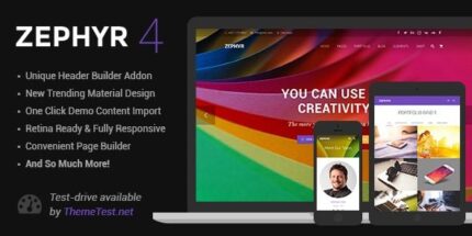
Zephyr 8.43.1 – Material Design Theme

Zephyr delivers a modern solution for WordPress with authentic motions and responsive interactions, built on Material Design to captivate visitors. It elevates your site’s visual appeal while ensuring fast, retina-ready graphics and precise detail across devices. Choose Zephyr for design-minded layouts, seamless integration, and easy customization that keeps users engaged.
Description
Zephyr is a modern WordPress theme designed to help you present your content with authentic motion and responsive interactions. Built on Material Design principles, it brings a refined visual system, clear hierarchy, and carefully timed animations that guide visitors naturally through your pages.
It also focuses on performance and fidelity with fast loading patterns and retina-ready, ultra-high resolution graphics. Across phones, tablets, and desktops, Zephyr keeps details crisp and layouts consistent, making it easier to create engaging, design-forward sites that feel polished from first scroll to last.
Main Features
- Material Design styling — Uses Material Design-inspired visuals to deliver a clean, cohesive interface.
- Authentic motions — Includes purposeful animations that add life without overwhelming the content.
- Responsive interactions — Adapts interaction behavior to different screen sizes for a consistent experience.
- Hierarchical timings — Coordinates animation timing based on content structure to improve readability.
- Retina-ready graphics — Supports ultra-high resolution visuals for sharp display on high-density screens.
- Fast, performance-minded layout — Built to keep pages feeling quick while showcasing motion and detail.
- Precise responsive detail — Maintains accurate spacing, typography, and visual alignment across devices.
- Easy customization — Adjusts the look and presentation to match your brand and content.
- Design-minded layouts — Provides structured page composition focused on modern aesthetics.
Benefits
- More engaging UX — Motions and responsive interactions make pages feel interactive and intuitive.
- Clearer content flow — Hierarchical timings support better scanning and understanding of key sections.
- Sharper visual impact — Retina-ready graphics improve clarity and perceived quality on all screens.
- Improved mobile experience — Precision in responsive detail helps maintain usability on phones and tablets.
- Faster-feeling pages — Performance-minded design supports smoother browsing while showcasing visuals.
- Brand-aligned presentation — Easy customization helps keep your site’s style consistent with your goals.
Who is it suitable for?
- Design-focused WordPress sites that need modern motion and interaction
- Portfolio websites and creative studios
- Blogs and content publications aiming for a polished, readable layout
- Landing pages that benefit from clear visual hierarchy
- Small businesses refreshing their WordPress presence with a Material-inspired look
- Web agencies building client sites that require easy visual customization