
Vertikal 2.0.0 – Responsive WordPress Theme
Vertikal is a responsive WordPress theme designed for modern websites, offering a mobile-friendly layout and a clean, professional look. Customize your pages quickly in the WordPress editor, maintain consistent branding across sections, and launch with a structure built for search visibility. Ideal for portfolios, small business sites, and content brands.
Description
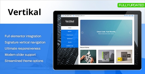
Vertikal is a responsive WordPress theme designed to help you present your content with a modern, mobile-first layout. It solves a common website problem: pages that look different across devices and require constant redesign. With a clean structure built for WordPress, you can create consistent pages for portfolios, blogs, and business sites without fighting your layout. The result is a smoother browsing experience that supports strong engagement and easier site management.
Whether you’re starting from a template layout or refining your pages over time, Vertikal helps you keep your design organized and readable across screen sizes, improving usability for visitors and making your WordPress site simpler to maintain.
Main Features
- Responsive, mobile-first layout — Adapts to phones, tablets, and desktops for consistent viewing.
- WordPress theme templates — Provides ready-to-use page structures for common site types.
- Customizable header and navigation — Lets you shape how visitors access your key pages.
- Typography and layout controls — Helps you maintain readable spacing and visual hierarchy.
- Widget-ready areas — Enables flexible placement of WordPress widgets in key sections.
- Blog-friendly structure — Supports content presentation for posts, pages, and archives.
- SEO-oriented markup — Uses clean, semantic HTML practices to support search visibility.
- Performance-focused design — Aims to keep pages lightweight for faster loading.
Benefits
- Better mobile UX — Improves readability and navigation on small screens.
- Faster publishing — Template layouts help you launch pages with less setup work.
- Higher engagement — Clear structure supports longer time on site and easier scanning.
- More consistent branding — Customization options help keep pages visually aligned.
- Stronger SEO foundation — Clean markup and content structure support improved indexability.
Who is it suitable for?
- Personal blogs and content sites on WordPress
- Small business websites that need responsive consistency
- Portfolio and creative projects requiring clean page layouts
- Marketing landing pages built from WordPress templates
- Agencies managing multiple WordPress client sites
- Non-technical owners who want easier site updates
