
Unik 2.0.0 – Responsive Multi-Purpose Theme
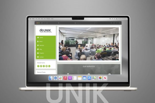
Unik is a responsive multi-purpose WordPress theme designed to support a wide range of website types, from portfolios to small business pages. Its clean, adaptable layouts help visitors find key content quickly on any device, while consistent styling supports professional branding and straightforward publishing in WordPress.
Description
Unik is a responsive, multi-purpose WordPress theme built for creating modern websites across different niches. It helps you move from idea to a polished layout faster by combining flexible page sections with theme-wide styling controls. If you use Elementor, Unik’s structure is designed to fit smoothly into a workflow that relies on pages, blocks, and templates. The result is a theme foundation that supports both content and commerce-style layouts.
Whether you’re setting up a landing page, portfolio, business site, or WooCommerce-focused storefront, Unik aims to reduce setup friction. Its mobile-first approach and customizable components help you maintain consistent design while adapting pages for each visitor goal.
Main Features
- Responsive layout — Automatically adapts pages to desktops, tablets, and mobile screens for consistent viewing.
- Multi-purpose design — Covers multiple website types with ready-to-use section styles and layouts.
- Elementor compatibility — Fits common Elementor-based page building patterns for faster page creation.
- Theme customization options — Adjust typography, colors, and layout settings to match your brand.
- Template kit style sections — Provides structured starting points you can adapt for different pages and use cases.
- Reusable header and footer layouts — Create consistent navigation and branding across the whole site.
- WooCommerce-ready structure — Supports storefront-style pages and product-focused content sections.
- Performance-minded codebase — Designed to keep pages lightweight for smoother user experiences.
Benefits
- Faster setup — Start from pre-structured layouts and adapt them instead of building everything from scratch.
- Better UX on mobile — Responsive styling improves readability and navigation across devices.
- More consistent branding — Global customization helps align headers, typography, and sections site-wide.
- Higher engagement — Clear section layouts make it easier for visitors to find what they need.
- Improved conversion paths — WooCommerce-ready sections support product browsing and goal-driven pages.
Who is it suitable for?
- WooCommerce stores that need a flexible theme foundation
- Small businesses building a modern WordPress website
- Agencies creating websites for multiple clients
- Freelancers and portfolios using Elementor for layout control
- Content-focused blogs needing consistent templates
