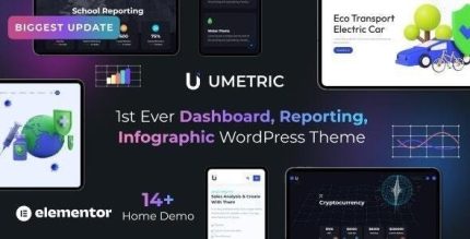
Umetric 2.0.4 – WordPress Dashboard, Reporting and Infographic Theme

Umetric is a reporting and infographic theme for WordPress that helps you create stunning presentation sites with charts and data visualization elements. It delivers a clear, benefit-driven experience by turning complex data into compelling visuals, with easy-to-use dashboards and seamless integration for your content.
Description
Umetric is a Reporting and Infographic theme for WordPress designed to help you build presentation sites that communicate data clearly. Instead of relying on long tables, it turns complex information into charts and data visualization elements that people can understand quickly. It also supports dashboard-style layouts, making it easier to organize reports and highlight key metrics on the same page. With Umetric, you can present your findings in a clean, structured way that fits WordPress content workflows.
Main Features
- Reporting-focused layout — Theme sections built for presenting metrics and summaries as part of a cohesive page flow.
- Charts and data visualizations — Built-in chart elements to help you display information visually.
- Infographic presentation elements — Infographic-style components for transforming data into readable visuals.
- Dashboard-style sections — Organize reporting content into dashboard-like blocks for quick scanning.
- Presentation-ready templates — Page designs intended to support storytelling with data on WordPress.
- Clear content integration — Easy placement of your data visuals alongside your WordPress content.
- Multiple visualization options — A range of chart and visualization elements for different reporting needs.
Benefits
- Better data clarity — Visual charts make complex metrics easier to interpret.
- Improved audience engagement — Infographic-style visuals help keep attention on the key points.
- Faster decision-making — Dashboard organization supports quicker scanning of results and KPIs.
- Stronger report storytelling — Presentation-focused sections help you communicate insights, not just numbers.
- Consistent visual communication — A unified theme style keeps dashboards and charts cohesive across pages.
Who is it suitable for?
- Analytics and reporting professionals
- Agencies creating data-driven client presentations
- Marketing teams sharing campaign performance
- Educational projects and online courses with charts
- Startups and product teams tracking KPIs
- Content creators publishing data-backed posts