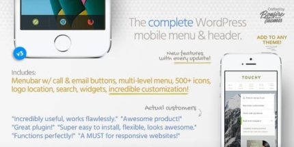
Touchy 5.0.0 – WordPress Mobile Menu Plugin

Touchy is a premium WordPress plugin delivering a fast, mobile-first menu and header designed for smartphones. It’s quick, responsive, and incredibly easy to use, boosting mobile navigation while still working smoothly on desktop. Benefit: seamless integration, modern design, and a superior user experience.
Description
Touchy is a premium WordPress plugin that delivers a fast, mobile-first menu and header built specifically for smartphones. It solves the common problem of clunky mobile navigation by providing a responsive, touch-friendly experience that feels smooth on small screens. The plugin is designed to be quick and reactive, helping visitors find what they need without friction. Because it’s also tested to work well on desktop browsers, you can use it across devices without creating separate navigation experiences. Touchy is a practical choice when you want modern header/menu UX in a WordPress site using themes and page layouts (including Elementor-based builds) while keeping mobile usability a priority.
Main Features
- Mobile-first menu layout — Prioritizes smartphone navigation patterns for easier access on small screens.
- Responsive header behavior — Adjusts naturally between mobile and desktop browsing so the interface stays consistent.
- Fast and reactive performance — Designed for quick interactions that help keep page experiences snappy.
- Touch-friendly usability — Optimized for comfortable finger navigation on mobile devices.
- Works on desktop browsers — Maintains usability not only on phones, but also on full desktop layouts.
- Device testing focus — Built after thorough checks across different mobile devices to reduce layout surprises.
- Easy to use in WordPress — Straightforward operation to help you set up without complex workflow changes.
Benefits
- Better mobile UX — Clear, touch-friendly navigation reduces confusion and improves usability on smartphones.
- Higher engagement — Faster, more reactive menu interactions help visitors explore key pages more readily.
- Consistent cross-device experience — A responsive header/menu keeps navigation familiar for both mobile and desktop users.
- Lower bounce risk — Smoother mobile access can reduce frustration when users try to find content quickly.
- Seamless integration — Fits naturally into WordPress setups, including theme-based and Elementor-based layouts.
Who is it suitable for?
- WooCommerce stores that need mobile-friendly category and page access.
- Small business websites and landing pages focused on smartphone visitors.
- Blogs and content sites aiming for smoother navigation on the go.
- Web agencies building consistent WordPress and Elementor projects.
- Portfolios and corporate sites that want a modern, responsive header/menu experience.
- Online communities and membership sites where quick navigation improves retention.