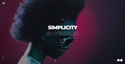
Stylex 1.7 – Creative Showcase Portfolio WordPress

Stylex is a fully responsive WordPress theme with a modern design that helps photographers, artists, and designers showcase their work using powerful video and imagery. Built on Elementor for a smooth, drag-and-drop page building experience, it delivers a fast, mobile-friendly WordPress theme that looks great on any device and any screen size.
$59
$1.97
-97%
Add to cart
Instant download after purchase
ClamAV scanned · Clean
Plus activation available for this item. Slots included with Full Year +Plus. Should work without activation, but may require it for additional features.
Description
Stylex is a fully responsive WordPress theme built for creatives who want to present visual work with clarity and impact. It’s designed to solve the common issue of websites that don’t look consistent across desktops, tablets, and mobile screens. With a modern layout centered on strong video and imagery, Stylex helps photographers, artists, and designers tell their stories through media-first pages. The theme is built on Elementor, so you get a smooth drag-and-drop workflow for composing your site. It’s also optimized to feel fast and polished, no matter what device visitors use.
Main Features
- Fully responsive design — Adapts layouts automatically to different screen sizes and orientations.
- Modern creative styling — Clean, contemporary visuals tailored for artistic portfolios and showcases.
- Video-forward presentation — Highlights motion content alongside your key projects.
- Imagery-focused layout — Makes photos and visual works the centerpiece of your pages.
- Elementor integration — Uses Elementor for drag-and-drop page building.
- Mobile and tablet usability — Maintains a consistent experience on phones and tablets.
- Fast, smooth page feel — Built to stay responsive while you browse and build pages.
- Flexible content arrangement — Lets you structure sections that support media-led storytelling.
Benefits
- Better UX on every device — Responsive layouts reduce layout issues and improve readability.
- Stronger visual communication — Video and imagery placement helps visitors engage with your work faster.
- Faster page building — Elementor’s drag-and-drop approach makes it easier to assemble pages.
- More consistent brand presentation — A modern design keeps your portfolio looking cohesive across screens.
- Improved engagement — Media-first structure encourages longer time on site.
Who is it suitable for?
- Photographers building a portfolio website
- Artists showcasing artwork and visual series
- Designers presenting projects and creative work
- Creative studios and freelance professionals
- Agencies creating Elementor-based WordPress sites for clients