
Stockholm 9.14.4 – A Genuinely Multi-Concept Theme
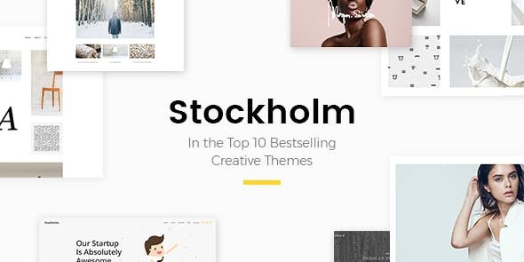
Stockholm is a versatile WordPress theme designed to build stunning websites for restaurants, hotels, shops, offices, weddings, and blogs. It delivers unlimited header layouts, parallax media, customizable mega menus, and responsive design for fast, professional results. Choose it for easy, flexible design and powerful branding—explore its layouts and unleash your site.
Description
Stockholm is a versatile WordPress theme built for creating modern, branded websites across many industries. It helps you solve the “one layout doesn’t fit my business” problem with flexible structure options, from header styles to content navigation. With parallax media and video background sections, your pages can feel more engaging without complex setup. Designed for responsive performance, Stockholm also supports blog-style publishing for restaurants, hotels, shops, offices, weddings, and beyond.
Whether you need a one-page experience, a multi-section landing page, or a content-driven site, the theme’s layout controls and menu system help you build clear paths for visitors and keep your branding consistent.
Main Features
- Parallax Image/Video Slider — Adds layered motion to showcase images or video in an eye-catching way.
- Unlimited Header Layouts — Create different header styles for pages without being limited to a single design.
- Unlimited Title Area Layouts — Customize title sections to match the look and purpose of each page.
- Customizable Mega Menu — Organize navigation with richer dropdown-style menus for complex sites.
- Left Menu with Page-Specific Background — Use optional background image and color, changing by page for better visual alignment.
- Fullscreen Menu — Present navigation in a fullscreen overlay for a focused, modern UX.
- Sticky Content Menu — Build a menu from selected sections on the page for easy section access.
- Anchor Functionality in Menu — Navigate to sections on the same or different pages using anchors.
- Video Background Sections — Use video backgrounds to enhance hero and section storytelling.
- Fixed and Sticky Header Options — Keep the logo and navigation visible using fixed or sticky header styles.
Benefits
- More engaging pages — Parallax sliders and video backgrounds create memorable visuals that support your brand story.
- Clear navigation — Mega menus, fullscreen menus, and anchor links help visitors find content faster.
- Better UX for long pages — Sticky content menus and section-based anchors improve usability on one-page layouts.
- Consistent styling — Unlimited header and title area layouts let each page match its purpose without losing cohesion.
- Responsive-ready experience — A mobile-friendly, responsive theme helps maintain professional presentation across devices.
Who is it suitable for?
- Restaurants, hotels, and travel-related websites
- Shops and retail brands needing strong navigation
- Law firms and corporate business pages
- Wedding planners and event-focused one-page sites
- Architecture, interior design, and photography portfolios
- Blogs for lifestyle, fashion, and healthy living topics
