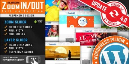
Responsive Zoom In/Out Slider 5.4.6

Responsive Zoom In/Out Slider is a versatile WordPress slider plugin that delivers dynamic zoom effects across fixed dimensions, full width, or full screen layouts. It’s designed to grab attention with smooth transitions, offering easy setup and seamless integration for stunning visual stories. Bonus: video tutorials and live preview help you explore its capabilities and choose the best fit.
Description
Responsive Zoom In/Out Slider is a versatile WordPress slider plugin that adds dynamic zoom effects to your visual content. It helps solve the problem of static, unengaging hero sections by delivering smooth zoom-in and zoom-out transitions within a responsive layout.
Designed to work across fixed dimensions, full width, or full screen, it lets you choose a presentation style that fits your page structure. With an easy setup flow, plus a live preview and video tutorials, you can quickly test the look and confirm it matches your theme and template kit for stunning visual storytelling.
Main Features
- Zoom In/Out transitions — Creates attention-grabbing zoom-in and zoom-out motion for slider slides.
- Responsive behavior — Adapts the slider layout so the effect remains consistent across devices.
- Fixed Dimensions version — Keeps the slider constrained to a set size for precise placement in your layout.
- Full Width version — Expands the slider across the page for a bold, edge-to-edge presentation.
- Full Screen version — Uses a full-screen layout to highlight key visuals as the primary focus.
- Smooth motion — Uses fluid transitions to keep animations visually comfortable and readable.
- Live preview — Lets you test the effect before committing changes to your WordPress pages.
- Video tutorials — Guides you through setup so you can configure the slider with less trial and error.
Benefits
- More engaging visuals — Zoom effects draw attention to your images and improve on-page interaction.
- Better layout fit — Fixed dimensions, full width, and full screen options help match your theme design.
- Improved UX — Smooth transitions make motion feel controlled instead of distracting.
- Quicker configuration — Live preview and tutorials reduce setup time and help you refine results faster.
- Consistent storytelling — Responsive presentation keeps the visual message clear across screen sizes.
Who is it suitable for?
- WooCommerce stores that want a stronger hero section for promotions and featured products
- WordPress bloggers and publishers building image-led content pages
- Agencies creating consistent layouts with theme and template kit designs
- Portfolio and creative sites that rely on polished visual storytelling
- Small business websites that need responsive, attention-focused page sections
- Landing pages for campaigns where visual impact drives user attention