Responsive Tab Elementor Addon Plugin 1.0.2
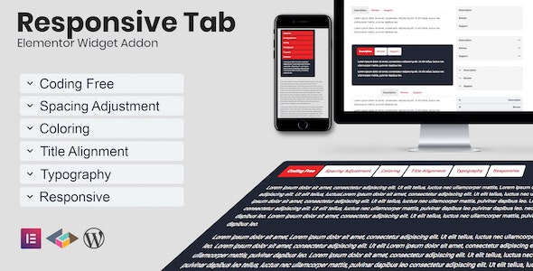
Responsive Tab Elementor Addon Plugin is a WordPress plugin that delivers a responsive tab widget for Elementor, transforming tabs into accordions as screen width changes. It uses a single widget to create both tabs and accordions, boosting UX and mobile readability, with easy setup and seamless Elementor integration. Explore it today.
Description
The Responsive Tab Elementor Addon Plugin is a WordPress plugin that adds a responsive tab widget for Elementor. It helps you present structured content clearly without forcing users to scroll through long sections. On larger screens, it displays traditional tabs for quick navigation.
When the layout shifts to smaller devices, the same widget automatically transforms tabs into accordions based on screen width. This improves mobile readability and keeps key information easy to reach.
Built for seamless Elementor integration, the plugin uses a single widget to generate both tabs and accordions, so you can set up responsive sections with less duplication and a more consistent editor workflow.
Main Features
- Responsive tab widget — Displays content in tabs on desktop while adapting for smaller screens.
- Tab-to-accordion transformation — Automatically switches from tab layout to accordion layout at different screen widths.
- Single widget workflow — Builds both tabs and accordions from one Elementor widget.
- Elementor integration — Designed to work inside the Elementor page builder experience.
- Mobile-friendly content layout — Reduces horizontal scanning and improves vertical readability on phones.
- Consistent structure — Keeps the same content organization across devices for a predictable UX.
- Simple setup — Quick to add within Elementor for responsive sections without complex configuration.
- Screen-width driven behavior — Uses responsive rules based on viewport changes to trigger the layout switch.
Benefits
- Better mobile UX — Accordions make content easier to read and interact with on smaller screens.
- Faster content discovery — Tabs help users jump to the right section without excessive scrolling.
- Higher engagement — Clear structure can improve time on page by keeping information accessible.
- Reduced editor duplication — One widget generates both layouts, simplifying responsive page building.
- Consistent presentation — The same content setup across devices supports a more uniform user experience.
Who is it suitable for?
- WooCommerce store owners building product details, FAQs, or feature sections in Elementor.
- Content creators and bloggers using Elementor templates to organize long-form pages.
- Web agencies creating responsive landing pages for clients.
- Portfolio or service sites that need compact, mobile-friendly section navigation.
- Education and course websites presenting modules, lesson outlines, or summaries.
- Any WordPress team using Elementor themes and template kits that require responsive tabs.