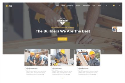
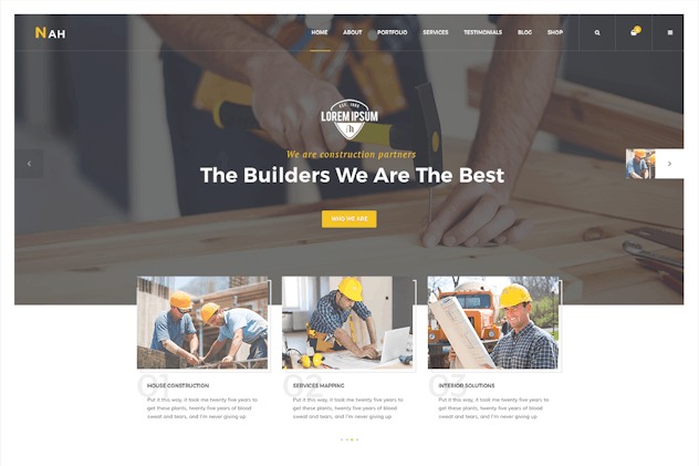
Nah 1.0 – Multipurpose Construction responsive HTML5 Template
Description
Nah is an HTML5 template designed to showcase your work with a clean, modern layout that adapts smoothly across desktop and mobile. It solves the common challenge of presenting portfolios and projects in a way that looks polished and stays usable on every screen size. With animated boxes and a filterable portfolio, visitors can explore content more naturally, without getting stuck on long lists. The template supports responsive layouts and offers both full-width and boxed presentation styles, so you can match your brand layout quickly.
Whether you’re building a personal site, agency page, or project showcase, Nah helps you publish structured content faster by starting from ready-to-use HTML sections. It’s also a practical base for WordPress and Elementor workflows when you want a reliable, responsive design to adapt into your own pages or templates.
Main Features
- HTML5 foundation — Built with modern HTML5 structure for reliable rendering.
- Responsive layout — Adjusts spacing and content flow for desktops, tablets, and mobile.
- Animated boxes — Uses attention-grabbing animations to highlight key content areas.
- Filterable portfolio — Lets visitors sort projects by category for faster browsing.
- Full-width mode — Supports edge-to-edge sections for a bold, wide visual layout.
- Boxed layout option — Provides a centered, contained look for a more traditional page style.
- Mobile-friendly performance — Keeps the design consistent across devices with smooth display behavior.
- Showcase-ready sections — Layouts are organized for presenting work, projects, and listings clearly.
Benefits
- Faster publishing — Start from ready-made template sections to reduce layout work.
- Better UX on mobile — Responsive design improves readability and interaction on smaller screens.
- More engagement — Animated boxes guide attention to important elements without overwhelming the page.
- Quicker project discovery — Filterable portfolio navigation helps visitors find relevant work sooner.
- Flexible page styling — Full-width and boxed options make it easier to match different site aesthetics.
- Consistent presentation — Cross-device consistency supports a more professional first impression.
Who is it suitable for?
- Freelancers and personal portfolio websites
- Creative agencies showcasing client projects
- Designers and developers presenting case studies
- Businesses needing a modern landing or showcase page
- WordPress users building custom pages with Elementor
- Any site that benefits from a filterable portfolio layout