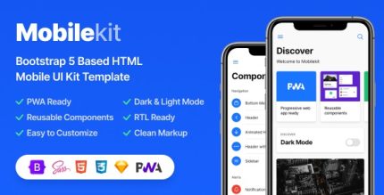
Mobilekit 2.9.1 – Bootstrap 5 Based HTML Template
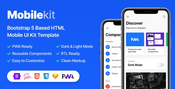
Mobilekit is a powerful WordPress mobile UI kit template for mobile websites and PWA projects. Easy to use with components, based on Bootstrap 5, it streamlines design bringing fast, responsive layouts. Ideal for boosting mobile UX with plug-and-play blocks, seamless integration, and modern UI.
Description
Mobilekit is a mobile UI template kit for WordPress, designed for building mobile websites and progressive web app (PWA) projects with a modern interface. It helps you solve the common challenge of creating consistent, mobile-friendly layouts without starting from scratch. The kit is organized around reusable components, so you can assemble screens faster and maintain visual consistency across the whole project.
Built on Bootstrap 5, Mobilekit delivers responsive structure that adapts to smaller screens and touch interactions. With plug-and-play blocks, it streamlines the design workflow and supports smoother development of mobile UX for landing pages, app-like experiences, and PWA-ready layouts.
Main Features
- Mobile-focused UI layout — Templates and sections are structured for comfortable viewing and interaction on small screens.
- WordPress template kit — Ready-to-use layout assets help you build mobile pages within the WordPress workflow.
- Bootstrap 5 foundation — Uses Bootstrap 5 styling and grid behavior to support reliable responsive design.
- Reusable components — Component-based blocks make it easier to assemble different sections without rebuilding styles.
- Plug-and-play blocks — Swap in sections as building blocks to accelerate page creation.
- Fast responsive layouts — Layouts are designed to scale cleanly across common mobile resolutions.
- Modern UI sections — Visually consistent interface elements help maintain a polished look across pages.
- Seamless integration approach — Designed to fit into mobile website and PWA-style page structures.
Benefits
- Faster page builds — Plug-and-play blocks reduce the time spent creating mobile layouts from scratch.
- Better mobile UX — Mobile-first structure supports clearer navigation and improved touch-friendly presentation.
- Consistent design system — Reusable components help keep spacing, typography, and UI patterns uniform.
- Responsive confidence — Bootstrap 5 foundation improves consistency across devices and screen sizes.
- Smoother iteration — Swapping sections makes it easier to refine designs without starting over.
Who is it suitable for?
- WordPress developers building mobile websites
- PWA project teams that need app-like, mobile-ready UI
- Agencies creating multi-page mobile landing experiences
- Product teams prototyping mobile-first marketing pages
- Designers who want a Bootstrap 5-based foundation for UI layouts