Lapa 1.9.1 – Minimal & Modern WooCommerce Theme
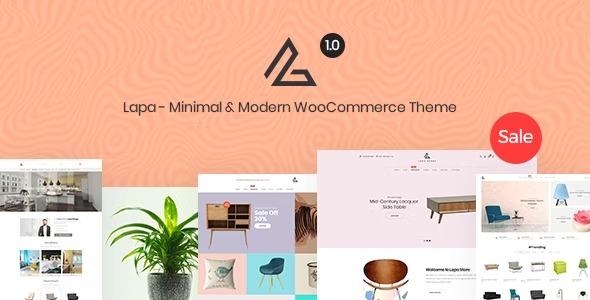
Explore Lapa, a WordPress solution offering 10 unique demos you can mix and match across variants for complete creative freedom. Create stunning headers and footers with modular layouts, delivering effortless customization and responsive results. A smart choice for designers who value flexible components, smooth integration, and standout site visuals.
$59.00
$1.97
-97%
Add to cart
Instant download after purchase
ClamAV scanned · Clean
Plus activation available for this item. Slots included with Full Year +Plus. Should work without activation, but may require it for additional features.
Description
Lapa is a WordPress theme built to help you create distinctive websites without being locked into a single layout. It comes with 10 unique demos arranged as separate sets, so you can start quickly and adjust the look to match your vision.
With modular header and footer layouts, Lapa makes customization straightforward, including multiple header options and mobile-ready designs. You can mix components across variants, giving you complete creative freedom while keeping the final result consistent, responsive, and visually focused.
Main Features
- 10 unique demo sets — Start from ready-made layouts designed as separate, well-managed variants.
- Mix-and-match components — Combine elements across different demo variants for custom page structures.
- Modular header layouts — Swap header parts easily to build the header you want.
- 9+ header styles — Choose from multiple ultimate header arrangements for different visual directions.
- Ultimate mobile header — Use mobile-optimized header layouts to keep navigation clear on small screens.
- Modular footer system — Apply an organized footer layout structure that fits your design goals.
- Ultimate footer layout — Select a complete footer style designed to complement your site.
- Responsive results — Ensure your headers and footers adapt cleanly across devices.
Benefits
- Faster design setup — Launch with curated demo sets instead of building from scratch.
- More layout freedom — Mix header and footer components across variants to match your brand.
- Better mobile UX — Mobile header layouts help improve usability on phones and tablets.
- Consistent site identity — Modular headers and footers keep visual structure cohesive across pages.
- Clean presentation — Responsive layouts support a smooth browsing experience and stronger engagement.
Who is it suitable for?
- WordPress designers building multiple site concepts
- Agencies that need flexible layouts for client projects
- Freelancers creating portfolio and landing-page websites
- Small businesses updating branding-focused web pages
- Content-focused websites that need clear header and footer structure