Full-screen Slider for Elementor 1.0.10
Description
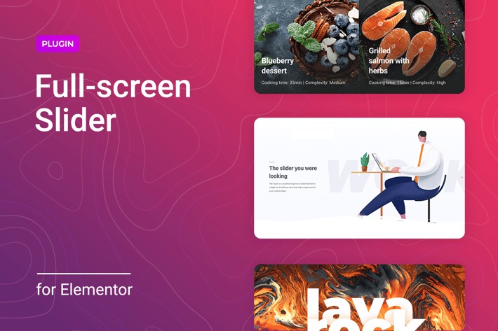
Full-screen Slider for Elementor is a WordPress plugin designed to help you build immersive, responsive full-screen sliders directly inside the Elementor editor. If you want your hero section, landing page, or product showcase to feel more engaging, this slider tool replaces static banners with smooth, story-driven transitions. The plugin integrates seamlessly with Elementor so you can design slide content and layout without breaking your workflow. It focuses on easy configuration, customizable visuals, and consistent results across screen sizes.
Whether you’re highlighting services, promoting campaigns, or organizing key messages, the full-screen approach makes your site feel more dynamic while keeping attention on your most important content. Create polished slider experiences with transitions that look refined and layouts that adapt to mobile, tablet, and desktop.
Main Features
- Full-screen slider layout — Displays slides as immersive, edge-to-edge sections for maximum visual impact.
- Elementor integration — Works within the Elementor workflow so you can edit and preview without switching tools.
- Customizable slides — Configure slide content and styling to match your website design.
- Smooth transitions — Use refined slide movement to improve flow between key messages.
- Responsive design — Ensures the slider looks consistent across common screen sizes.
- Easy-to-use interface — Provides a straightforward way to manage slider settings while building pages.
- Visual storytelling setup — Helps you structure multiple slides for step-by-step messaging on landing pages.
Benefits
- Higher engagement — Full-screen visuals draw attention and encourage visitors to stay longer.
- Better user experience — Smooth transitions make the page feel more polished and easier to follow.
- More effective messaging — Customizable slides help you highlight priorities in a clear sequence.
- Stronger conversion paths — Cleaner hero sections can improve clicks toward key actions.
- Consistent cross-device results — Responsive behavior supports a unified look on mobile and desktop.
Who is it suitable for?
- WooCommerce stores needing standout landing pages
- Designers building Elementor-based marketing sites
- Agencies creating responsive page templates for clients
- Content-driven blogs and portfolios with hero storytelling
- Online schools and training providers promoting programs
- Product sites that need a dynamic, full-viewport showcase