Flaton 1.6.8 – WooCommerce Responsive Digital Theme
Description
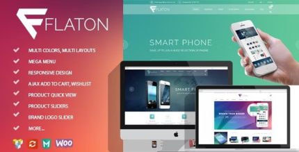
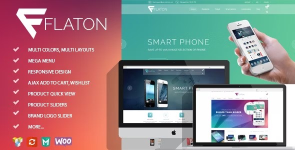
Flaton is a responsive WooCommerce theme for WordPress, built specifically for digital, mobile, laptop, and accessories stores. It solves a common storefront problem: visitors need to find products quickly and understand them at a glance, without clutter. With clean product layouts and a bright white background, your catalog stays readable and organized across devices. Accent colors in blue, green, or pink add visual clarity while keeping the focus on what customers are buying. The result is a smooth shopping experience and a storefront that’s easy to tailor to your brand.
Flaton is designed around strong product presentation and effortless customization, so you can refresh your look while maintaining a consistent, modern layout throughout your shop.
Main Features
- Responsive WooCommerce Layout — Adapts cleanly to mobile, tablet, and desktop screens.
- Store-Focused Product Design — Highlights catalog items with clear, product-first page structure.
- White Background Aesthetic — Keeps content readable and reduces visual noise for product browsing.
- Accent Color Options — Uses blue, green, or pink accents to match your storefront style.
- Clean, Fast Product Grids — Uses streamlined layouts for quicker scanning of items.
- Smooth Shopping Experience — Supports intuitive navigation for moving through the shop.
- Effortless Theme Customization — Makes it easier to adjust the look and feel of your storefront.
- Ready for Digital Accessories Shops — Suited to digital downloads and tech accessories categories.
Benefits
- Better UX for Shoppers — Clear layouts make it easier to browse and compare products.
- Higher Conversion Potential — Strong product focus helps visitors reach purchase decisions faster.
- Improved Mobile Engagement — Responsive design supports comfortable viewing on phones and tablets.
- Consistent Brand Styling — Accent color choices help maintain a cohesive, modern storefront.
- Cleaner Product Presentation — White-space and minimal styling improve readability and reduce distraction.
Who is it suitable for?
- WooCommerce stores selling digital goods
- Mobile, laptop, and accessories retailers
- Tech-focused startups launching an online shop
- Creators and small businesses building a modern storefront
- Agencies supporting WordPress eCommerce clients
- Online catalogs that need a clean, product-first layout