
Crocoblock Layout Switcher 1.0.1
Crocoblock Layout Switcher helps you clearly highlight the difference between two content blocks on WordPress pages, guiding visitors to notice critical details. As a WordPress plugin, the main benefit is improved focus and engagement with a clean, flexible design. A quick, user-friendly tool that integrates smoothly with your workflow, inviting you to explore its layouts.
Description
Crocoblock Layout Switcher is a WordPress plugin designed to help you clearly highlight the difference between two content blocks on a page. Instead of letting important details blend in, it guides visitors to notice key information where you want it most.
By presenting content with a clean, flexible layout approach, it improves focus and engagement on WordPress pages. It’s a practical tool for creators who want their layouts to feel more intentional and easier to scan, without disrupting the flow of their existing design workflow.
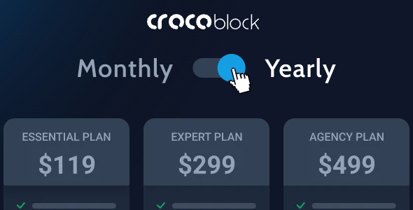
Main Features
- Two-block comparison — Show two content blocks side by side or in an easy-to-switch layout so differences are immediately noticeable.
- Attention-focused layout — Emphasize critical details to reduce missed information and improve readability.
- Flexible presentation — Keep your design consistent with a clean visual structure across the page.
- WordPress page compatibility — Use it within your WordPress posts and pages to organize key sections effectively.
- Simple configuration — Set up the switcher quickly using the plugin’s workflow so you can publish without complexity.
- Clear visitor guidance — Help users understand what’s important by steering their eyes to the highlighted content.
- Better content hierarchy — Strengthen the way sections relate to each other, making pages easier to navigate.
Benefits
- Higher engagement — Visitors spend more time on the content that matters most.
- Improved UX — A focused layout makes pages easier to scan and understand at a glance.
- More persuasive storytelling — Clearly contrasting two blocks supports faster comprehension of your message.
- Cleaner design — Maintains a consistent, uncluttered look while still drawing attention to critical details.
- Better page structure — Organizing comparisons can strengthen overall information hierarchy and reduce confusion.
Who is it suitable for?
- Marketing sites that need to compare offers, features, or benefits
- WordPress agencies building client landing pages and layout variations
- Bloggers who want to spotlight key updates or before/after style explanations
- Course and membership websites showcasing critical differences across sections
- Content creators improving readability and section clarity
- Teams updating Elementor-based or template-driven WordPress page designs