Creatista 1.1.3 – MOTOPRESS – Portfolio WordPress Theme
Description
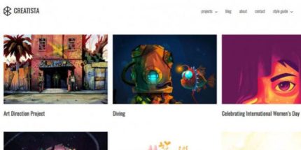
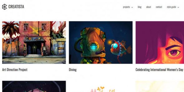
Creatista is a WordPress portfolio theme designed for designers, illustrators, and artists who want a clean, minimal way to present their projects. It helps solve the common portfolio problem of overcrowded layouts by prioritizing space for images, charts, and creative visuals. Built to work smoothly with WordPress, it uses responsive, mobile-ready design so your work remains clear and engaging on every screen size. With a flexible portfolio structure and a seamless installation process, Creatista makes it easier to launch a professional-looking creative site without fighting layout issues.
Creatista supports a wide range of creative fields, from illustration and cartooning to product design and hand-sketching, and it also suits motion graphic, 3D character, and cinema-style project presentations.
Main Features
- Minimal hand-crafted layouts — Balanced design that keeps focus on your artwork and case studies.
- Flexible portfolio showcase — Structure that adapts to different project types and content sizes.
- 100% responsive design — Ensures consistent viewing across desktop, mobile, and tablet devices.
- Mobile-ready gallery space — Minimizes theme elements to maximize the area used for showcasing works.
- Wide-screen project layouts — Helps motion graphics, cinema design, and other visual-heavy projects display effectively.
- Seamless installation process — Streamlined setup so you can start building your portfolio quickly.
- Suitable content dimensions — Presents images and media in dimensions optimized for each device.
Benefits
- Better visual focus — Minimal structure directs attention toward projects instead of distracting UI elements.
- Higher engagement — Responsive layouts improve readability and UX, encouraging visitors to explore more work.
- Stronger portfolio presentation — Flexible and wide-screen layouts display charts, photos, and mixed media more clearly.
- Device-ready UX — Optimized dimensions help your gallery look consistent on phones, tablets, and desktops.
- Faster site setup — A seamless installation process reduces friction when launching or redesigning your portfolio.
Who is it suitable for?
- Designers and illustrators building a project portfolio in WordPress
- Artists who need a minimal, image-forward layout for showcasing work
- Architects and interior designers presenting visual case studies
- Studios creating motion graphics, 3D characters, or cinema-style visuals
- Agencies supporting creative clients with responsive portfolio websites
- Independent creatives like cartoonists, product designers, and hand-sketch artists