Cize 1.1.1 – Electronics Store WooCommerce Theme
Description
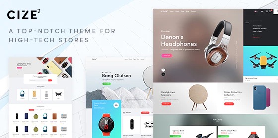
Cize is a mobile-first WooCommerce theme for high-tech shops, designed for customers browsing on smartphones, tablets, TVs, and other smart devices. It helps solve the common storefront problem of mobile pages that look cramped or slow, which can reduce product engagement and checkout progress. Built to deliver a fast, responsive shopping experience, Cize keeps navigation and product browsing clear on every screen size. For WordPress and WooCommerce store owners, it provides a storefront foundation that’s well-suited to electronics, gadgets, and related accessories.
With a layout language that prioritizes mobile UX, Cize supports smoother discovery of products and a more consistent look across devices. The result is a theme that helps shoppers stay focused while exploring categories and product details, without sacrificing performance or readability.
Main Features
- Mobile-first design — Prioritizes small-screen usability so shoppers can browse comfortably on phones.
- Responsive storefront layout — Adjusts smoothly across mobile, tablet, and desktop viewports.
- WooCommerce-oriented styling — Presents product and category content in a way that fits an eCommerce workflow.
- Performance-focused setup — Supports faster page experiences to help reduce friction during shopping.
- High-tech visual direction — Clean, modern presentation suited to smartphones, electronics, and smart devices.
- Conversion-friendly mobile experience — Keeps key browsing steps easy to follow on touch interfaces.
- Readable typography and spacing — Improves scan-ability for specs, features, and product information.
- Consistent UI across pages — Helps maintain a coherent look from listing to product pages.
Benefits
- Better mobile UX — Easier navigation and clearer layouts reduce drop-offs during browsing.
- Higher conversions — A smoother shopping flow supports more add-to-cart and checkout completion.
- Improved engagement — Fast, responsive rendering encourages shoppers to explore more products.
- Stronger product clarity — Improved readability helps users understand what they’re viewing.
- SEO-friendly experience — Responsive, performance-minded design supports a solid foundation for search visibility.
Who is it suitable for?
- WooCommerce stores selling smartphones, tablets, and consumer electronics
- Brands and retailers offering smart devices and home technology
- Online shops focused on tech accessories and connected peripherals
- Agencies building mobile-first eCommerce sites on WordPress
- Merchants with a catalog where mobile browsing needs to be fast and clear