Archcode 1.7 – Architect Design WordPress Theme
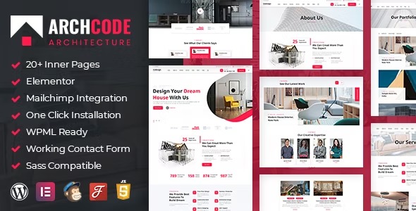
Archcode is a flexible WordPress theme designed for seamless device compatibility and real-device testing. It offers unlimited sidebars, Retina-ready visuals, and customizable Elementor elements for fast, tailored layouts. Enjoy effortless design, easy integration, and a touch of creativity—discover it today.
$59.00
$1.97
-97%
Add to cart
Instant download after purchase
ClamAV scanned · Clean
Plus activation available for this item. Slots included with Full Year +Plus. Should work without activation, but may require it for additional features.
Description
Archcode is a flexible WordPress theme built to deliver a consistent experience across devices. It focuses on real-device compatibility so your site layout looks right on phones, tablets, and desktops. With a flexible layout approach and retina-optimized visuals, it helps keep typography and imagery crisp. Archcode is also designed for smooth work with Elementor, letting you tailor key page elements without slowing down your workflow.
Whether you’re designing a landing page or building a full site, Archcode provides practical layout options and theme structure to support clear, device-ready design. It’s a useful choice when you want dependable responsiveness, faster layout creation, and Elementor-driven customization.
Main Features
- 100% fully responsive design — Adapts layouts to different screen sizes for a consistent look.
- Real-device compatibility testing — Designed to fit devices properly based on testing on real hardware.
- Flexible layout system — Helps your content stay structured as the viewport changes.
- Two home page layouts — Start with an additional home page option for different homepage structures.
- Unlimited sidebars — Add as many sidebar variations as needed across your pages.
- Custom Elementor elements — Use customized Elementor elements to build pages that match your design intent.
- Retina optimized visuals — Keeps images and UI elements sharp on high-resolution displays.
- Easy WordPress integration — Works within the WordPress theme workflow for straightforward setup and editing.
Benefits
- Better device experience — Responsive and real-device tested layouts reduce misalignment and layout issues.
- Improved UX clarity — Flexible structure helps users navigate content more naturally across screens.
- Faster page building — Elementor-focused elements speed up layout creation and customization.
- Higher visual quality — Retina optimization supports crisp, professional-looking visuals.
- More layout freedom — Unlimited sidebars enable page-specific structure without workarounds.
Who is it suitable for?
- Small business websites that need dependable responsive layouts
- Designers and freelancers using Elementor to customize page sections
- Agencies building multiple WordPress client sites
- Blogs and content sites focused on clean, device-ready presentation
- Landing page projects that require flexible homepage layouts
- Portfolios and creative sites aiming for sharp, retina-ready visuals