Showcase 3.6 – Responsive WordPress Grid / Masonry Blog Theme
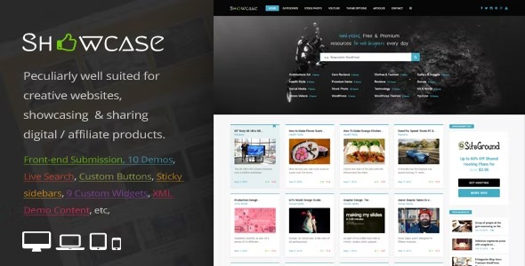
Showcase is a responsive WordPress grid/masonry blog theme crafted for creative sites and digital product showcases. It delivers fast, mobile-friendly layouts that look perfect on any device, boosting engagement and affiliate conversions. With an intuitive setup and elegant design, it’s easy to customize and integrate into any project—explore today.
$59.00
$1.97
-97%
Add to cart
Instant download after purchase
ClamAV scanned · Clean
Plus activation available for this item. Slots included with Full Year +Plus. Should work without activation, but may require it for additional features.
Description
Showcase is a responsive WordPress theme built for creative sites, blogs, and digital product showcases. It uses a grid and masonry layout to present content in an attractive, scroll-friendly way. This design helps solve the common challenge of making showcases look good on every screen size without layout breakage.
Ideal for affiliate and digital product pages, Showcase emphasizes mobile-friendly formatting and an elegant structure that stays consistent on PCs and phones. With an intuitive setup, you can quickly deploy the theme across different website types and customize the look to match your branding.
Main Features
- Responsive grid layout — Displays posts and showcase items in a clean grid that adapts to different screen widths.
- Masonry blog style — Arranges content in a masonry pattern to reduce empty space and improve visual rhythm.
- Mobile-friendly presentation — Ensures layouts and spacing look correct on mobile devices for comfortable reading and browsing.
- Fast, lightweight structure — Focuses on performance-minded layouts to support quick page experiences.
- Designed for creative showcases — Optimized for showcasing digital products and creative content with an elegant visual flow.
- Intuitive theme setup — Makes it straightforward to launch the theme for different WordPress projects.
- Easy customization — Lets you adjust the theme’s styling and appearance to fit your site’s identity.
- Consistent desktop and mobile UX — Keeps the experience coherent across PCs, tablets, and phones.
Benefits
- Better mobile UX — Responsive layouts improve readability and navigation on small screens.
- More engaging browsing — Grid and masonry presentation encourages users to keep exploring content.
- Clearer product visibility — Showcase-friendly design helps digital and affiliate offerings stand out.
- Faster time to launch — Intuitive setup supports quicker deployment across WordPress projects.
- Consistent branding — Simple customization helps maintain a cohesive look across pages and posts.
Who is it suitable for?
- Creative portfolios and studios
- Digital product and affiliate content websites
- Bloggers who publish resources, guides, or curated collections
- Agencies building multiple WordPress sites with a consistent visual style
- Personal websites featuring galleries, updates, and showcase posts