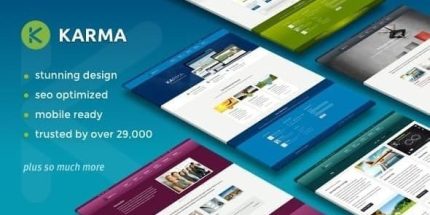
Karma 6.3.1 – Elementor Business Theme

Karma is a responsive WordPress theme built for mobile-friendly sites, ensuring every page looks stunning on phones and tablets. Its ready-made templates provide a smooth, fast-loading visual environment, delivering the main benefit of high usability and conversion potential. Plus, design and integration are effortless, making setup a breeze.
Description
Karma is a responsive WordPress theme designed to keep every page looking sharp on phones and tablets. It helps solve a common problem for mobile traffic: layouts that break, content that shifts, and visuals that lose impact on smaller screens. With ready-made page templates and responsive layouts, you can build a mobile-friendly website environment that supports clear reading and smooth navigation.
Built with research-driven responsiveness in mind, Karma focuses on high usability and a conversion-friendly presentation. The theme’s design and integration are streamlined so setup feels quick and straightforward within WordPress.
Main Features
- Fully responsive layout — Adapts page structure and elements to different screen sizes for consistent viewing.
- Mobile-optimized templates — Includes ready-made templates and layouts created for a responsive visual experience.
- Tablet and phone friendly design — Ensures typography, spacing, and components remain readable on smaller devices.
- Fast-loading visual environment — Helps maintain performance-focused page presentation for quicker, smoother browsing.
- Reusable page layouts — Lets you start from established structures instead of designing from scratch.
- Easy WordPress setup — Streamlines theme installation and page creation for faster publishing.
- Consistent element styling — Keeps page elements aligned with the theme’s responsive design rules.
- Built for mobile-friendly websites and applications — Works well for products and services where mobile UX matters most.
Benefits
- Better mobile UX — Reduces layout issues, improving comfort and clarity for phone and tablet visitors.
- Higher conversion potential — A clean, mobile-ready presentation supports user actions on key pages.
- Faster time to publish — Ready-made templates and layouts help you launch without starting from a blank design.
- Consistent branding — Responsive styling keeps your pages looking cohesive across devices.
- Improved usability signals — Well-structured mobile pages can support stronger engagement and lower bounce behavior.
Who is it suitable for?
- WooCommerce stores that need a mobile-first theme for product and category pages
- Business websites targeting mobile visitors and on-the-go customers
- Landing pages and marketing sites for apps and digital services
- Blogs that prioritize readable, responsive article layouts
- Agencies creating responsive WordPress sites for clients
- Portfolio and personal websites built for tablet and phone viewing