
Slideout 1.0 – Mobile Website Template
Slideout is a mobile website template for WordPress that makes navigation a breeze with a simple swipe to reveal sleek menus and elegant content on any device. It delivers a smooth, user-friendly experience, improving engagement and accessibility. Plus, effortless integration and modern design make it the smart choice for mobile sites.
Description
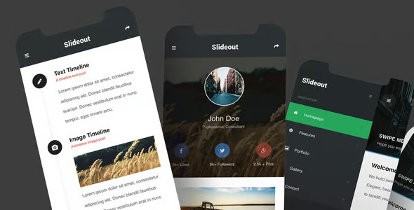
Slideout is a mobile website template kit for WordPress that improves on-screen navigation by using a simple swipe gesture to reveal menus. It helps solve the common mobile problem of cramped headers and hard-to-tap navigation, replacing it with an uncluttered, touch-friendly layout. Designed for any device size, it keeps content easy to read while maintaining a smooth, user-focused experience. With modern styling and a straightforward integration into your WordPress site, Slideout supports pages that feel polished, accessible, and engaging.
Main Features
- Swipe-to-open navigation — Users can reveal a menu with a natural swipe interaction on mobile devices.
- Mobile-first layout — Prioritizes comfortable viewing and tap targets for small screens.
- Sleek slideout menus — Keeps navigation visually tidy while still presenting key sections.
- Responsive content presentation — Displays your pages and sections cleanly across different device sizes.
- Smooth, user-friendly interactions — Supports a seamless browsing experience that feels responsive.
- Improved accessibility focus — Helps make navigation more usable for a wider range of visitors.
- Modern visual design — Uses an elegant look to present content without visual clutter.
- Effortless WordPress integration — Designed as a template kit so you can apply it within your WordPress workflow.
Benefits
- Better mobile UX — Swipe navigation reduces friction compared to crowded mobile headers.
- Higher engagement — Easier access to sections encourages visitors to explore more pages.
- More accessible browsing — Clear navigation patterns support improved usability for diverse users.
- Cleaner content focus — Slideout menus keep the page layout calm and readable.
- Consistent experience — Responsive structure helps maintain usability across devices.
Who is it suitable for?
- WordPress site owners building mobile-first experiences
- Blogs and content websites that need easy navigation
- Small business websites looking for a cleaner mobile layout
- Creative portfolios that want an elegant, touch-friendly design
- Agencies preparing website builds for clients
- Landing pages that benefit from simplified mobile navigation
