
Peak 7.6.5 – Themify Theme
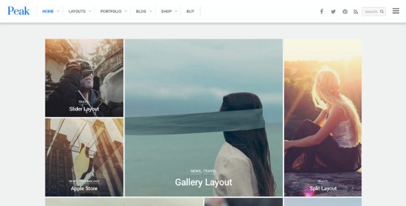
Peak is a modern grid-based WordPress theme featuring a responsive masonry tiles layout that adapts to any screen and lets you set custom tile sizes. With optional mega menu, multiple post layouts, slide-out widgets, portfolio support, and WooCommerce compatibility, this multi-purpose theme makes it easy to create beautiful blogs, magazines, portfolios or shops.
Description
Peak is a modern, grid-based WordPress theme built for responsive masonry tile layouts. It automatically generates and aligns tiles in a clean grid so content stays visually organized across devices.
Whether you’re crafting a blog, magazine-style homepage, portfolio grid, or an e-commerce storefront, Peak helps you control how content is presented. You can also set custom tile sizes to fine-tune the look and rhythm of your page layouts.
With optional mega menu support, multiple post layouts, slide-out widgets, portfolio functionality, and WooCommerce compatibility, Peak is designed to work well with common WordPress and WooCommerce workflows.
Main Features
- Responsive masonry tiles layout — Uses a masonry-style grid that adapts smoothly to different screen sizes.
- Custom tile sizing — Lets you define tile dimensions for more tailored layout composition.
- Auto-populated grid alignment — Automatically populates and aligns tiles for a consistent, structured look.
- Optional mega menu — Adds a richer navigation experience for categories and site sections.
- Multiple post layouts — Provides layout options for presenting articles, cards, and content blocks.
- Slide-out widgets — Supports off-canvas widget areas to keep key elements accessible without clutter.
- Portfolio support — Helps showcase projects in a grid-friendly format.
- WooCommerce compatibility — Integrates with WooCommerce to support product and shop pages.
Benefits
- Stronger UX for content browsing — Masonry tiles keep pages scannable while adapting to mobile and desktop.
- More flexible page design — Custom tile sizes make it easier to match your content’s visual hierarchy.
- Clearer navigation — Mega menu options improve access to categories and key sections.
- Improved engagement — Multiple post layouts help present posts and portfolios in varied, readable formats.
- Smoother shopping experience — WooCommerce compatibility supports coherent layouts for product browsing.
- Lower clutter — Slide-out widgets help surface extras without crowding the main content area.
Who is it suitable for?
- WooCommerce stores and product catalogs
- Blogs and news sites using content-rich homepage layouts
- Online magazines that need strong visual post presentation
- Portfolio sites for creatives and studios
- Agencies building multi-layout WordPress websites
- Small e-commerce brands looking for a modern, grid-driven design
