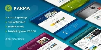
Karma 6.0.9 – Responsive WordPress Theme

Karma is a WordPress theme that delivers a flawlessly responsive design across smartphones, tablets, and desktops, ensuring a seamless browsing experience. Its core benefit is perfect mobile rendering with an easy toggle to disable responsiveness, giving you control. Bonus: clean design, easy customization, and smooth integration—explore it now.
Description
Karma is a WordPress theme built to deliver a consistently responsive layout across smartphones, tablets, and desktop screens. It helps your content render cleanly so visitors don’t have to pinch, zoom, or fight misaligned elements while browsing.
With Karma’s mobile-first rendering, the theme supports a seamless experience from small screens to larger displays. You also get a straightforward option to disable responsive behavior when you need a fixed-width layout for specific pages or layouts.
Main Features
- Fully responsive design — Adapts your pages to fit different screen sizes for readable, well-aligned layouts.
- Perfect mobile rendering — Ensures your key sections display properly on smartphones without awkward scaling or overflow.
- Responsive toggle — Lets you easily disable responsive behavior when you prefer a non-responsive presentation.
- Clean, modern design — Provides a tidy visual structure that keeps layouts focused on your content.
- Easy customization — Adjust styling details to match your brand while keeping the theme’s layout intact.
- Consistent spacing and layout — Maintains harmony between elements as the viewport changes across breakpoints.
- Smooth front-end experience — Supports a practical browsing flow across devices for a more comfortable read.
Benefits
- Better UX on every device — Visitors get a layout that stays readable and properly aligned on mobile, tablet, and desktop.
- Higher engagement potential — Fewer layout issues can lead to longer browsing sessions and more confident navigation.
- Controlled layout behavior — The responsive toggle helps you maintain a fixed look where responsiveness isn’t desired.
- Cleaner presentation — A clean design structure supports clarity, improving how users perceive your content.
- Faster site updates — Simple customization makes it easier to refine styles without restructuring pages.
Who is it suitable for?
- Small business websites that need consistent mobile layouts.
- Personal portfolios and freelancers showcasing projects on mobile.
- Blogs and content sites prioritizing readability across devices.
- Landing pages that sometimes require non-responsive, fixed-width layouts.
- WordPress users who want straightforward theme customization.
- New WordPress site builds aiming for a clean, responsive foundation.