Magnitude 1.0.2 – Multi-Purpose Elementor Website & eCommerce Builder WordPress Theme
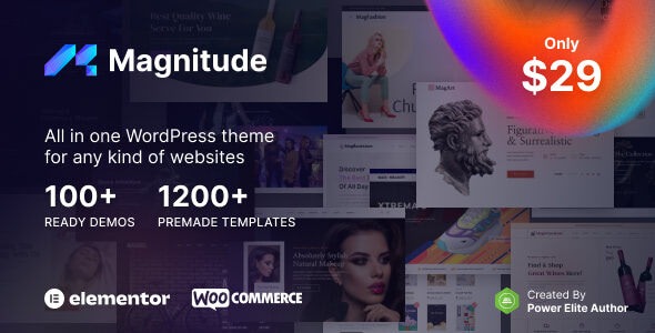
Magnitude is a 100% responsive WordPress theme that delivers mobile-optimized, retina-ready design with off-canvas content and adjustable site width. It helps you create fast, visually stunning websites that look great on any device, boosting engagement and conversions. With easy customization and seamless integrations, explore modern, flexible design for your site.
$59.00
$1.97
-97%
Add to cart
Instant download after purchase
ClamAV scanned · Clean
Plus activation available for this item. Slots included with Full Year +Plus. Should work without activation, but may require it for additional features.
Description
Magnitude is a 100% responsive WordPress theme designed to help you build mobile-optimized, retina-ready websites that look sharp on every screen size. It addresses the common problem of layouts breaking on phones by using an off-canvas content approach and a flexible structure. You can fine-tune your site’s appearance with an adjustable site width that fits your design goals. The result is a faster-feeling, more engaging experience that supports better user behavior and conversions.
With easy customization and seamless integrations across your WordPress setup, Magnitude is a practical choice for modern builds that need both visual impact and reliable responsiveness.
Main Features
- 100% responsive layout — Automatically adapts to phones, tablets, and desktops for consistent viewing.
- Mobile-optimized design — Prioritizes readable, touch-friendly presentation on smaller screens.
- Retina-ready visuals — Keeps typography and graphics crisp on high-resolution displays.
- Off-canvas content — Lets navigation and content move smoothly without crowding the main layout.
- Adjustable website width — Choose a layout span that matches your branding and content density.
- Easy customization — Quickly adjust styling and page presentation through the theme’s settings.
- Fast, smooth performance focus — Built to feel responsive and help reduce perceived load friction.
- Seamless WordPress integrations — Works well within a typical WordPress plugin-driven workflow.
Benefits
- Higher engagement — Mobile-friendly layouts keep visitors reading and interacting.
- Better conversions — Clear presentation and off-canvas navigation support smoother journeys to key actions.
- Improved UX — Retina-ready visuals and adjustable width create a more polished experience.
- SEO-friendly usability — Responsive, mobile-optimized structure aligns with modern search and usability expectations.
- Faster site feel — Performance focus helps pages feel quicker, encouraging users to stay longer.
Who is it suitable for?
- New WordPress website projects that need reliable responsiveness
- Business sites aiming for stronger mobile engagement and conversions
- Content creators publishing regularly and wanting a consistent layout
- Agencies creating multiple responsive client builds
- Landing pages or marketing sites that benefit from off-canvas navigation
- Teams that want a flexible theme without complex setup