Atelier 2.9.2 – Creative Multi-Purpose eCommerce Theme
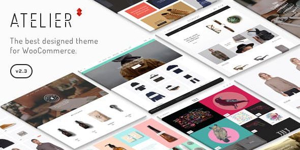
Atelier WordPress theme delivers fully responsive layouts across desktops, iOS, and Android, with retina-ready icons and images and clean Bootstrap-based code. It streamlines design and boosts user experience, helping you build fast, beautiful sites without extra plugins.
Description
Atelier is a WordPress theme designed to help you create fast, beautiful websites with a clean, modern layout. It delivers fully responsive design that’s been tested across desktop browsers, iOS, and Android, so your pages stay consistent on every screen size. Atelier also supports retina-ready icons and images, keeping graphics crisp without requiring additional plugins. With Bootstrap-based, semantic code, it streamlines the build process and supports a smoother user experience.
Whether you’re setting up a simple site or a content-heavy project, Atelier’s structure helps you focus on your design and content while maintaining usability across devices.
Main Features
- Fully responsive layouts — Adapts the site automatically to desktops, iOS, and Android screens.
- Cross-device testing — Verified behavior across common desktop browsers and mobile devices.
- Retina-ready icons & images — Ensures icons and visuals stay sharp on high-density displays.
- No extra plugins for retina support — Keeps visuals clean without adding plugin dependencies.
- Bootstrap 3.1.1 foundation — Uses Twitter Bootstrap for reliable, consistent UI layout behavior.
- Clean, semantic code — Structured HTML helps maintain clarity in the theme’s markup.
- Better readability across devices — Maintains legible spacing and alignment as screens change.
- User-experience focused design — Prioritizes smooth navigation and layout stability for visitors.
Benefits
- Improved mobile UX — Responsive layouts reduce layout shifts and keep content easy to use on phones and tablets.
- Crisper visuals — Retina-ready graphics enhance perceived quality, supporting better engagement.
- Faster setup — Bootstrap-based structure and clean code streamline theme usage without extra add-ons.
- Consistent design — Cross-device testing helps deliver stable presentation across browsers and operating systems.
- Maintainable foundation — Semantic code supports easier customization and long-term site upkeep.
Who is it suitable for?
- WordPress users building responsive business or portfolio sites
- Bloggers who need consistent mobile readability
- Agencies creating client websites that must work across devices
- Content creators publishing media-heavy pages with crisp graphics
- Small teams seeking a clean Bootstrap-based WordPress theme foundation