Toolset Layouts Migration 1.0

Toolset Layouts Migration is a WordPress plugin that lets you build Bootstrap-powered layouts with a drag-and-drop editor and output clean, pixel-perfect HTML. It delivers fully responsive designs across desktops, tablets, and phones, with effortless theme integration and precise grid control. Perfect for Bootstrap perfectionists—explore faster, visually precise layouts today.
Description
Toolset Layouts Migration is a WordPress plugin for building Bootstrap-powered page layouts with a drag-and-drop editor. It helps you avoid hand-crafting Bootstrap HTML while keeping full control over how your grid and elements behave. The plugin outputs clean, pixel-accurate markup so your designs match what you create.
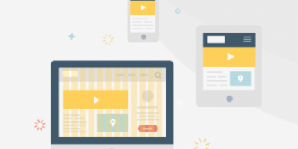
Use it to add responsive Bootstrap grids and structured content to pages, posts, and custom post types across virtually any theme. With precise grid control—including per-width adjustments and the ability to hide elements on smaller screens—you can deliver layouts that work reliably from desktop to mobile.
Main Features
- Drag-and-drop layout editor — Build Bootstrap layouts visually without writing repetitive HTML.
- Clean Bootstrap HTML output — Generates accurate markup that you can style predictably with your theme or CSS.
- Full Bootstrap element control — Exposes Bootstrap capabilities so you can configure elements precisely.
- Works as a page-builder on any theme — Create “the content” while keeping compatibility with your existing theme.
- Supports WordPress content types — Apply layouts to pages, posts, and custom post types.
- Fully responsive by design — Uses the Bootstrap framework to adapt layouts across desktops, tablets, and phones.
- Precise grid control — Manually tune how the grid appears at different widths for accurate positioning.
- Device-based visibility options — Hide parts of the layout on narrow screens when they shouldn’t appear.
Benefits
- Pixel-accurate results — Clean output aligns with the layout you designed, reducing styling back-and-forth.
- Faster layout creation — Drag-and-drop editing cuts time spent assembling Bootstrap structures.
- Better mobile UX — Responsive grids and controlled visibility improve readability and usability on phones.
- More consistent design — Same Bootstrap-driven approach across pages and custom post types.
- Maintainable styling — Predictable HTML makes it easier for themes and CSS to target elements.
Who is it suitable for?
- WordPress developers building Bootstrap-driven front ends
- Agencies creating reusable layouts for client sites
- WooCommerce stores using custom post types for product and category content
- Theme designers who want layout content inside any theme
- Content teams supporting consistent responsive marketing pages
- Blog and custom publishing workflows needing structured templates