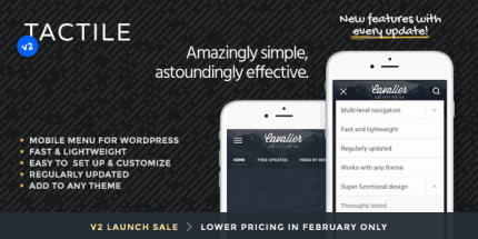
Tactile: WordPress Mobile Menu 2.1

Tactile WordPress Mobile Menu provides a touch-friendly header and multi-level dropdowns, turning mobile site navigation into a natural, effortless experience. Its highly customizable colors, backgrounds, fonts, and button animations deliver a polished, brand-aligned look with minimal effort. A lightweight WordPress type solution for clean design and smooth usability—explore today.
Description
Tactile WordPress Mobile Menu is a touch-friendly header and navigation plugin designed to make smartphone browsing feel natural and effortless. It helps you turn small-screen menus into a comfortable experience with clean, interactive multi-level dropdowns.
With extensive customization for colors, backgrounds, typography, and button animations, you can align the mobile header with your brand while keeping navigation smooth and easy to use. Tactile is built for WordPress themes and templates, so you can improve mobile UX without redesigning your site from scratch.
Main Features
- Fixed or absolute header positioning — Choose how the mobile header behaves on scroll.
- Background color with opacity control — Adjust header colors and transparency to match your layout.
- Header background image support — Add a background image and choose cover or pattern display, with opacity settings.
- Custom logo display — Show a logo as an image or as simple text with font size and color options.
- Multi-level dropdown menu — Enable nested navigation for complex site structures.
- Menu button animation options — Select animations that change into an “X” sign, a minus sign, or no animation.
- Dropdown width and typography controls — Set dropdown menu width and customize font sizes for main and sub-items separately.
- Per-element styling — Customize background, item colors, sub-menu indicator arrow, and dividers.
- Optional dropdown visibility — Hide the dropdown menu entirely when you only need the header.
Benefits
- Better mobile UX — Touch-friendly navigation reduces friction when users browse on small screens.
- Higher engagement — Multi-level dropdowns help visitors find sections without bouncing to other pages.
- Stronger brand consistency — Color, background, and font controls keep the header aligned with your site identity.
- Polished interactions — Button animation choices create clearer, more intuitive menu behavior.
- Simpler site adjustments — Detailed element-by-element settings let you refine the menu without code changes.
Who is it suitable for?
- WooCommerce store owners optimizing mobile navigation for product browsing.
- Business websites and landing pages with multi-level menu structures.
- Content sites and blogs that need clear access to categories and archives.
- Agencies managing multiple WordPress client sites and themes.
- Site owners rebuilding mobile headers without redesigning the entire theme.